NEW YORK, NY – Football season is barely one week away and the pennant races are just heating up in baseball, so naturally my attention has turned to something else. You see, being a Rams and Mets fan will lead you to do things like that come late August. My company is trying to come up with a new design for it’s letterhead and business cards, so I began thinking about some of the cooler and crazier emblems that have been associated with major sports franchises over the years. Some are timeless in their simplicity and execution – like the Dallas Cowboys star, the Chicago Blackhawk Chief and the Minnesota Viking horn. Others are much more subtle and contain more substance than might appear at first glance. There are also logos that defy explanation. It is from these last two categories which I would like to focus on today. Here are my some of the most Creative Sports Logos.
Hope you enjoy.
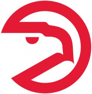 The Atlanta Hawks’ Pacman logo has an outline of a hawk inside a crude video game looking circle. This was cutting edge for the early 80’s people.

The Atlanta Falcons formed an F with their bird logo and earned tons of F’s on the field during the thirty years during which this logo was used.

The Montreal Expos are now defunct but hats sporting their logo are still running strong among rappers and rapper wanna-bes. Some people see a scripted M but others see the letters “e” “l” and “b” inside the logo… or some variations of. The Expos old media guide tries to solve this mystery claiming it was “M” “e” and “b” – which stood for Montreal Expos Baseball. The more I look at it the more it looks like it says JLo to me. I can even see a rockin’ ass if I stare long enough.
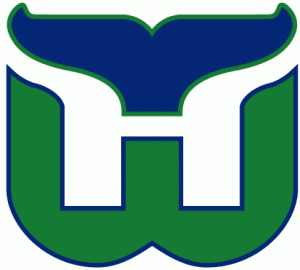 It took me a few years to figure out that the Whale logo not only had a H for Hartford but a W below for Whalers. Brilliant. Note: It is easier to see it in this logo than it was to identify from the jerseys worn by the players.
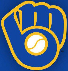 It also took me a few years to figure out that the Milwaukee Brewers mitt with a ball in the middle was made up of the letters M and B. Beyond Brilliant. Note: It is easier to see in this logo than it was to identify on the caps worn by the players.
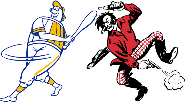
The original Brewer logo is made up of a tubby beer barrel-chested man swinging a bat. They had to change their logo because this eerily resembled the shape Hank Aaron was in during his Brewer playing days in the mid 70’s.


The 49ers used the above plaid-pajama pants-wearing cowboy(?) logo for nearly two dozens years – until 1966. Word is they will bring it back if they are able to sign Plaxico Burress.
This Ft. Wayne Pistons logo from the 1940’s shows the Tin Man was quite the point guard back in his salad days.
The best thing about this Denver Nuggets logo isn’t the pickaxe he is holding, the ABA ball he is palming, the ABA tube socks he is wearing, the ABA sneakers he is sporting or the beard and mustache he is rocking. Rather, it is the 70’s short-shorts he is styling. Luckily his nuggets aren’t hanging out of those shorts. God I love this dude.
Stay tuned tomorrow for Angry Ward, another dude who is not afraid to wear short shorts and tube socks.

