
MARLBORO, NY – Outside of the New York Yankees, the sports scene in the Big Apple sucks, as you’ve been recently reminded by the staff here at MTM. In an effort to keep things fresh, today I’m examining something else that is lacking for our local sports teams past and present… bad logos. With all the art galleries in and around this great city you’d think we could hire an artist to save us from some unimaginative and uninspiring design. Here’s a look at some majorly Flawed NY Sports Logos.
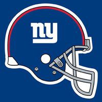 New York Football Giants: With a name as mighty as the Giants, it’s only fitting that their helmet logo is a lowercase “n” and “y.” HUH?! I know there is something to be said for tradition, as the logo dates back to the early 1960’s, but for a period the Giants used a more apropos block lettering during the 80’s and 90’s that gave a beefy appearance. Time for another re-do. The type-written look just doesn’t work on a football helmet.
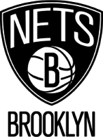 Brooklyn Nets: Technically, black and white are not colors (I won’t explain it but trust me) and it’s only fitting that this moribund bunch lack any primary color, too. The logo itself goes back to the Nets New Jersey days and had some color to it prior to their move to Brooklyn. The shield in the symbol has survived but why not incorporate the iconic Brooklyn Bridge in a new and marketable merchandise effort? You can add the other Barclay’s Center team, the Islanders, and the alternate jersey they sport on occasion in this argument.
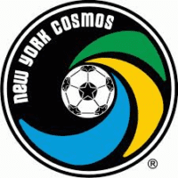 New York Cosmos: Two of the three colors, green and yellow, were inspired by the soccer-rich nation of Brazil and team owner Clive Toye’s obsession with Pele, whom he ultimately enticed to the tune of $1.4M per year to play in the NASL. There were some fantastic logos in the league back then but the Cosmos’ rendition wasn’t one of them, as the three colored arcs around the soccer ball were intended to imply movement. Boring… just like soccer!
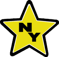 New York Stars: Once upon a time, long, long ago there was a start-up football league pre-dating the USFL called the WFL (World Football League). The New York team played on a fourth-rate surface relegated these days to rugby called Downing Stadium on Randall’s Island. The organization obviously held an art contest inside the NYC Public Schools system in order to come up with the team logo. A Boston-based owner adopted black and gold as the team colors and represented Broadway in the nickname and logo in the worst way imaginable.
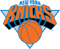 New York Knicks: I’m trying not to pile on this team but at least they incorporated the city’s colors of orange and blue into the scheme. The team nickname is traced backed to the Dutch settlers of New York who called themselves Knickerbockers so trying to get a uniform symbol out of this origin is difficult but anything might be better than a triangle behind block lettering and a basketball.
That’s it. Please comment below and come back tomorrow for a man who wears the Buffalo Bills logo on his chest, DJ Eberle. And please follow us on Twitter – @CheesyBruin & @MeetTheMatts, @Matt_McCarthy00, Instagram @MeetTheMatts and like our Facebook page, Meet The Matts.
